In this post, I show an approach to non-standard time intelligence analysis. This is, in fact, the second article on AutoExist. In the first, I explained the general principle of AutoExist. In this article, we will look at a practical example. It takes some exposition, though, and you will only find AutoExist in the third post on this topic.
Our model contains sales data for QuantoBikes. For this example, only a simple part of the model is used:
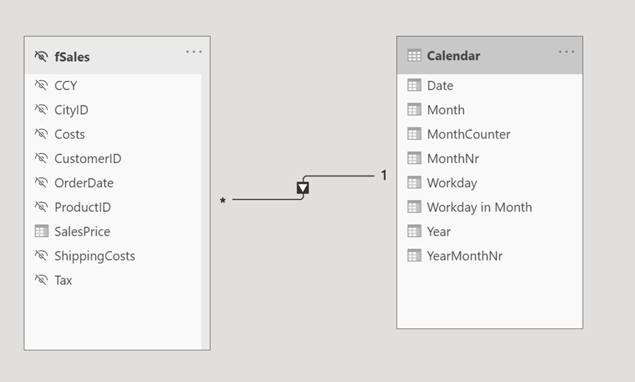
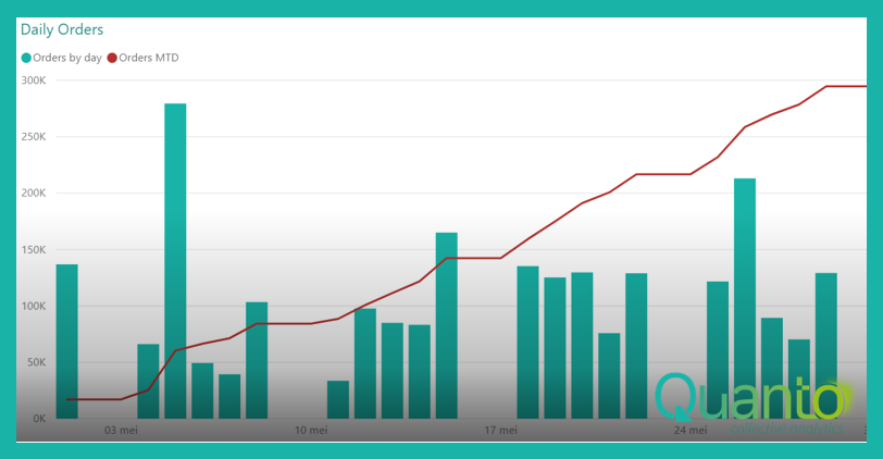
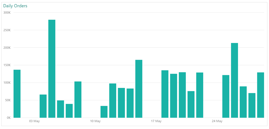
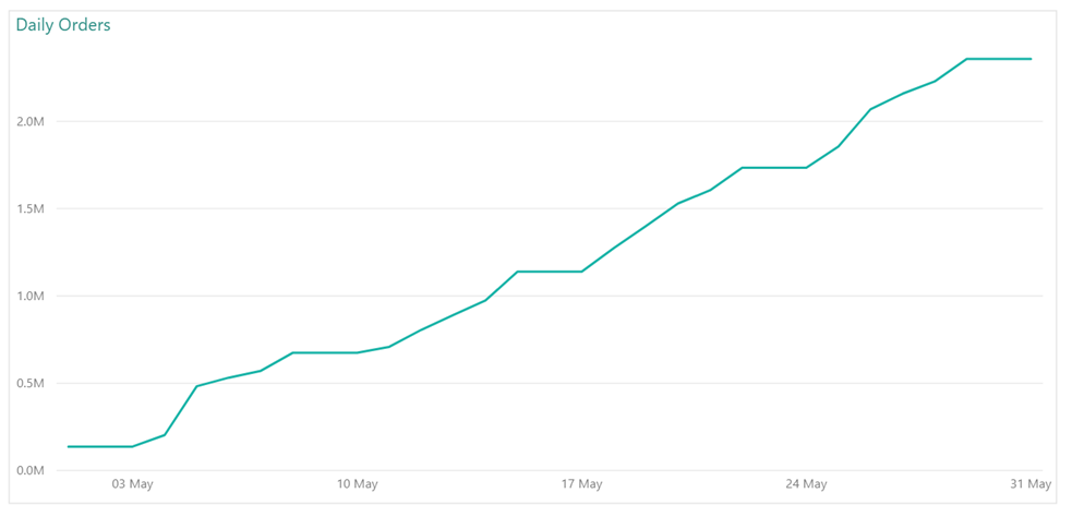
We have a fact table fSales with sales records which is related to a Calendar table on the OrderDate column. QuantoBikes employees spend their weekends with their families, meaning most of the orders are booked on workdays. Below is a typical chart of order value per day in May 2020:
We want to do some analysis on orders during the month and compare the current month with previous months. There are challenges ahead, as you will see. Let’s first create a month-do-date chart with the formula
![]()
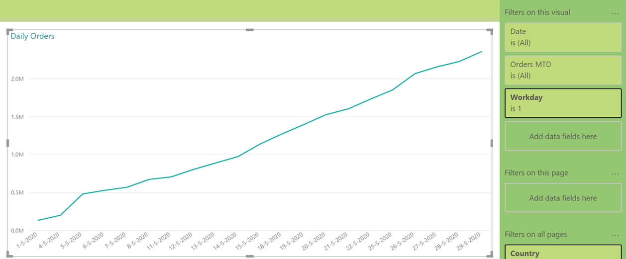
Measure [Orders MTD] uses the base measure [BaseSales] which is simply a SUM on the fSales[Sales Price] column. This is what the chart looks like:
It’s kind of a bumpy road, and the reason is, of course, the weekends without any sales. This is easy to change by simply filtering out the weekends. Our Calendar table conveniently contains a column [Workday] which is 0 for Saturdays and Sundays (you could add bank holidays and others as non-workdays as well, but we’ll stick with the weekends for this example). Make sure to set the X-axis on ‘Categorical’, or you will still see all dates.
Great. Now, let’s add a measure to show the month-to-date orders for the previous month. The straightforward way to do this is with a time intelligence function:
![]()
DATEADD() shifts the context on the Calendar table with a number of units, in this case one month back in time. When added to the chart, this is what we get (showing results for June 2020 now):
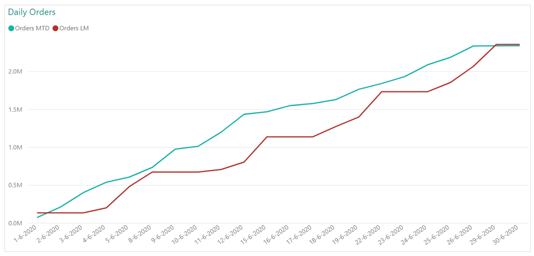
The red line, showing the results for May 2020, clearly looks very different from the line in the previous chart. Why is that? Well, the weekends cause trouble again. The 16th of June, for example, is in the chart so it is a workday, whereas the 16th of May is a Saturday. So, in the red line for [Orders LM], we do get to see weekend results and we miss some workday results.
We need a different calculation to be able to do a sound month-over-month analysis. You could argue over what the best comparison would be, but a reasonable approach may look like this: we number workdays in each month, and compare the first workday of the month with the first workday in the previous month without bothering about the actual dates. We compare the second workday with the second workday in the previous month, and so on.
There are no built-in DAX time intelligence functions that do this, so we are on our own here. To keep things simple, I created two columns in the Calendar table:
- [Workday in Month] is a sequence number of the date as a workday in the month: the 16th of June 2020 is the 12th workday in that month. You may want to give non-workdays a sequence number of an adjacent workday, in case there happen to be some orders on those days – but as our calculations all use month-to-date results, that is not really needed here.
- [MonthCounter] is a column containing a sequence number of a month in the total Calendar table. With this, we can move to the previous month by simply subtracting 1 from the current MonthCounter value, without having to bother about ending up in the previous year.
With these two columns, a workday-on-workday last month measure can be created with this formula:
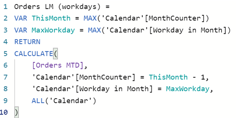
We store the largest [MonthCounter] and [Workday in Month] values in DAX variables, and move one month back in time by subtracting 1 from the current [MonthCounter], keeping the same [Workday in Month] value. Note that we do not use a time intelligence function anymore and therefore need to explicitly remove other filters from the Calendar table using ALL.
It makes sense to now put the [Workday in Month] on the X-axis instead of the [Date], although both yield the same visual (again for June and previous month May):
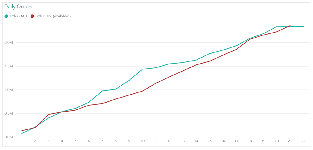
Looking good!
In the next post, we’ll dive into some issues in this analysis, which we will be able to solve leveraging the AutoExist feature.